Kenneth Toh
Projects: )AboutContact
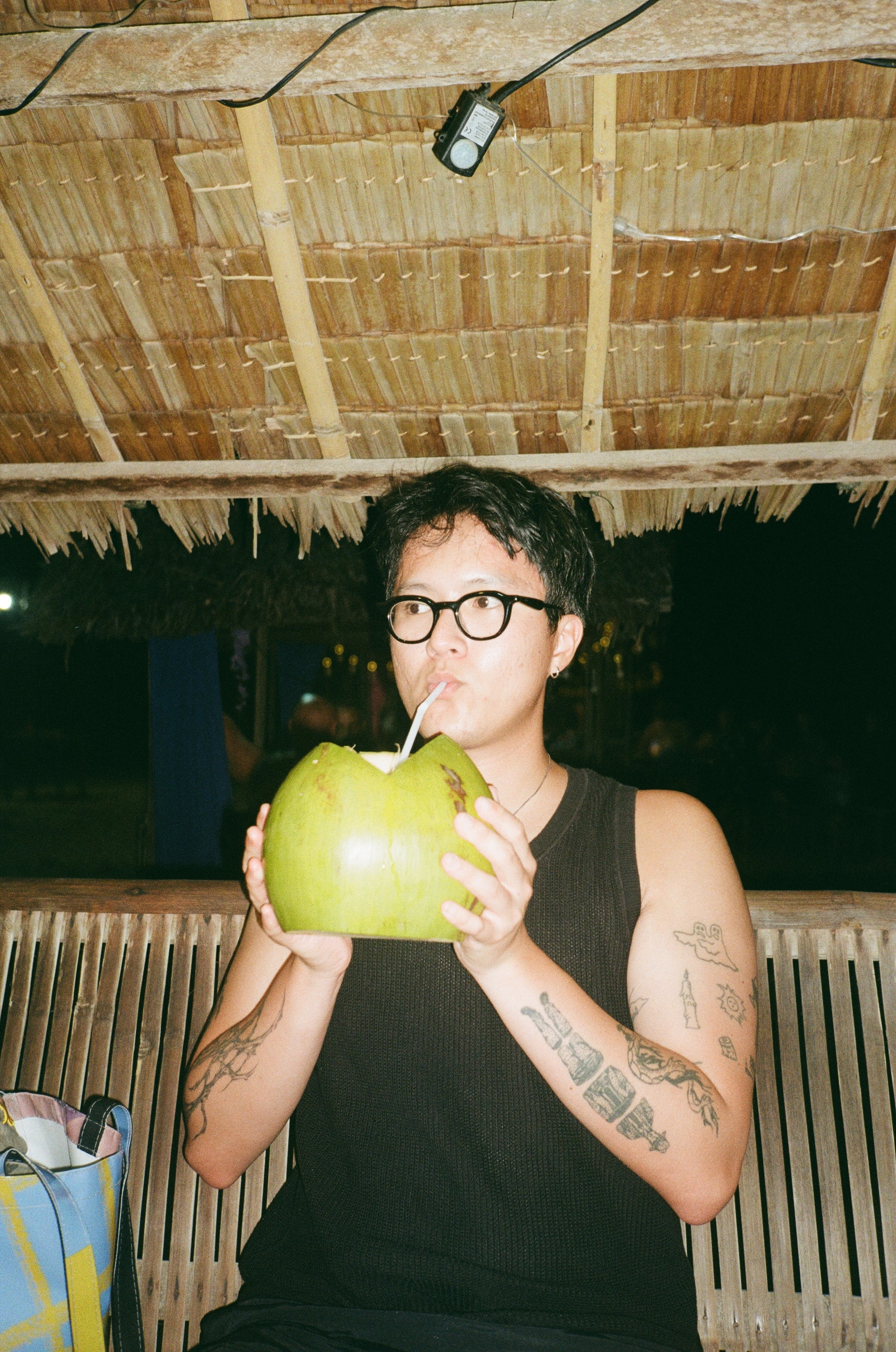
Kenneth Toh is a Singapore-born graphic designer based in Naarm/Melbourne. He works across publication design, web design, motion graphics, and identity, with additional interests in risograph printing and type design. Coming to design after a background in finance, he approaches projects with a balance of structure and experimentation — organised in process, open in outcome.

His work often plays with colour, layout, and pacing to create experiences that feel approachable and a little bit playful. He’s interested in how design can sit between the everyday and the considered — drawing from culture, memory, and small visual details. Whether working on print or digital, he focuses on clarity, warmth, and a light sense of personality in the final result.
Experience

↘ Nusantao Giftshop (2024→NOW)

Art director, photographer, social media manager,
payroll, paper folder, a.k.a. owner

Founded in Naarm, this online store is my way of sharing and celebrating Southeast Asian independent creatives who inspire me.

www.nusantao.store

Education

↘ Bachelor of Communication Design, Monash University

↘ Bachelor of Commerce, University of Melbourne

↘ Diploma in Business Studies, Temasek Polytechnic, Singapore

Acknowledgements

I acknowledge the Wurundjeri people of the Kulin Nation, the Traditional Custodians of this land, and pay my respects to Elders past and present. Sovereignty was never ceded, and that this always was and always will be Aboriginal land.

Esperanto Magazine
Art Direction
Identity
Publication

Esperanto Magazine is a student publication celebrating youth culture at Monash. As the Art Director in 2025, I shaped its visual identity, designed each issue, and helped bring the magazine to life across campus and online.

See more ↳
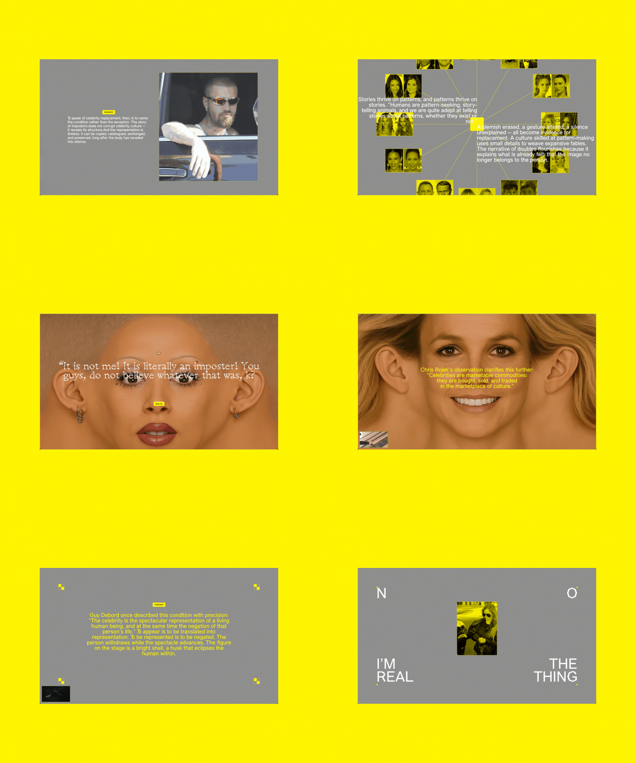
NO I'M THE REAL THING
Web

A project responding to the celebrity replacement theory, the work reflects on how celebrity culture turns people into objects, reimagining celebrities as reproducible objects in a digital cloning archive.

See more ↳
Field Sans
Typography

A sans-serif typeface shaped by the quiet experimentation of electronic music. It captures how small shifts in rhythm, tone, or form can create unexpected resonance.

Coming soon ↳
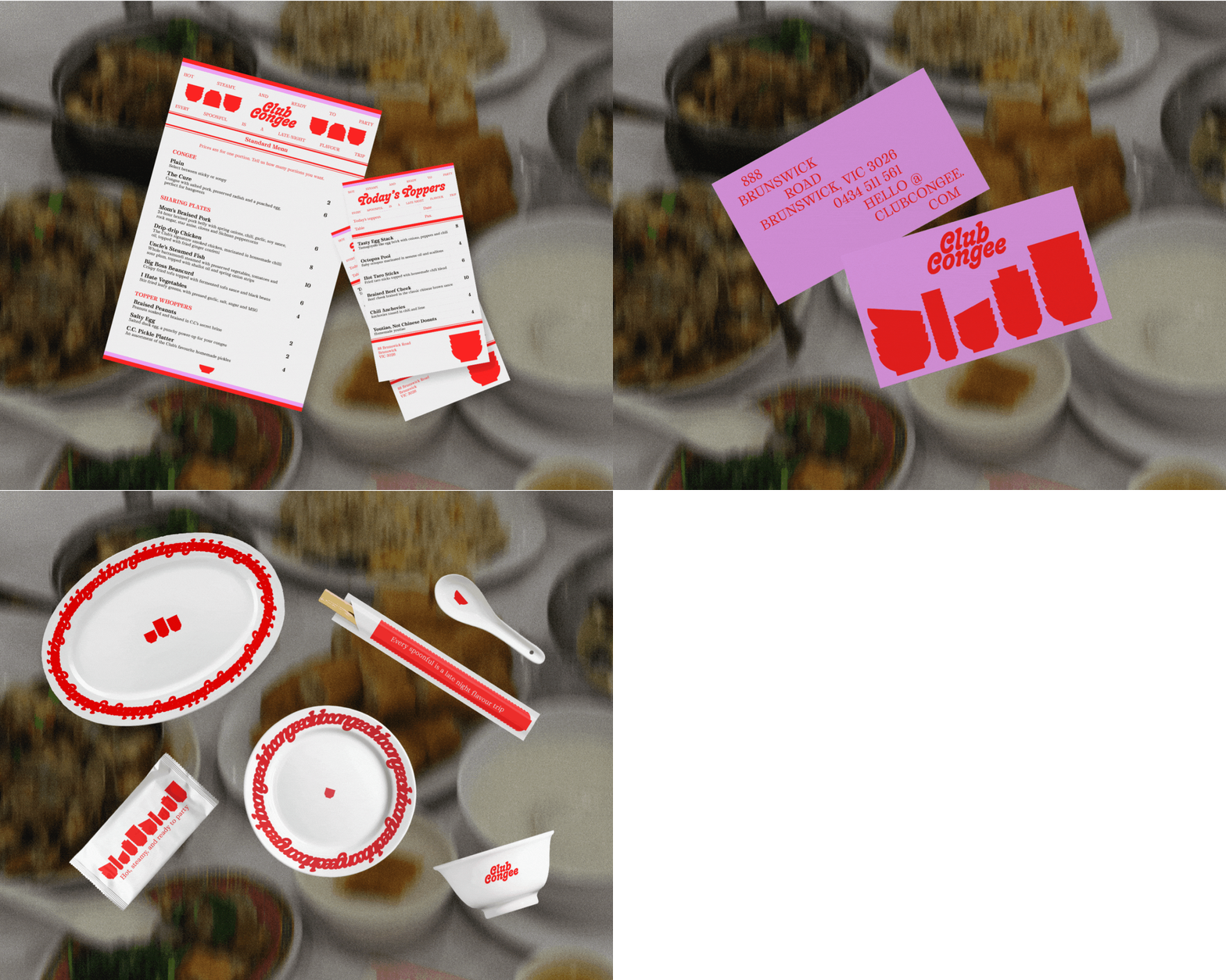
Club Congee
Identity
Art Direction

A visual identity concept for a Teochew-style late-night congee shop, combining the warmth of childhood memory with a playful, neon-tinged aesthetic.

See more ↳
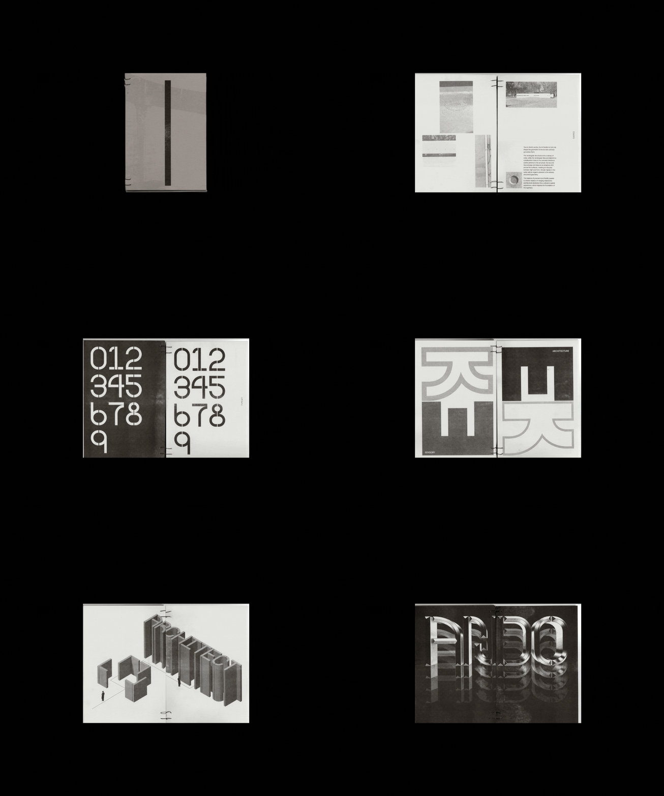
Ando Mono
Typography
Publication

A typeface inspired by Tadao Ando's MPavilion 2023 that examines the structural beauty of the site.

See more ↳
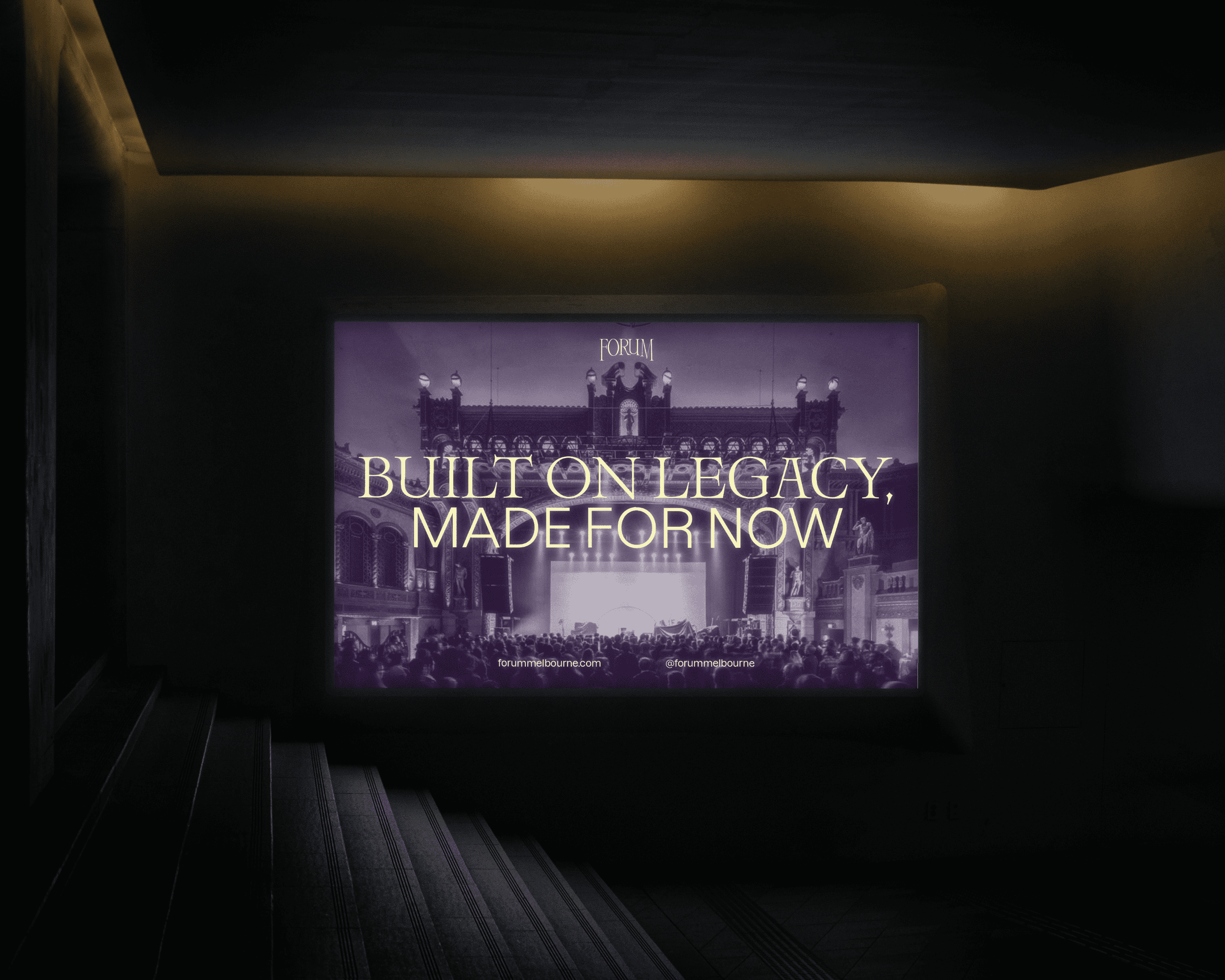
Forum Melbourne Identity Refresh
Art Direction
Identity

Forum Melbourne is a historic live music venue known for its character and atmosphere. This rebrand draws from its past while shaping a bold visual identity for its future, honouring what the Forum has been, and imagining what it can become.

See more ↳
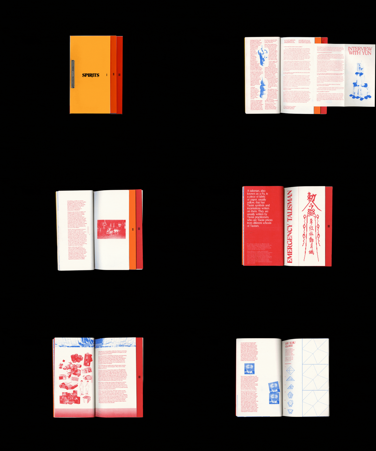
Spirits I II III
Publication

A reflexive publication that examines the loose ties between candles, ghosts, and soju.

See more ↳
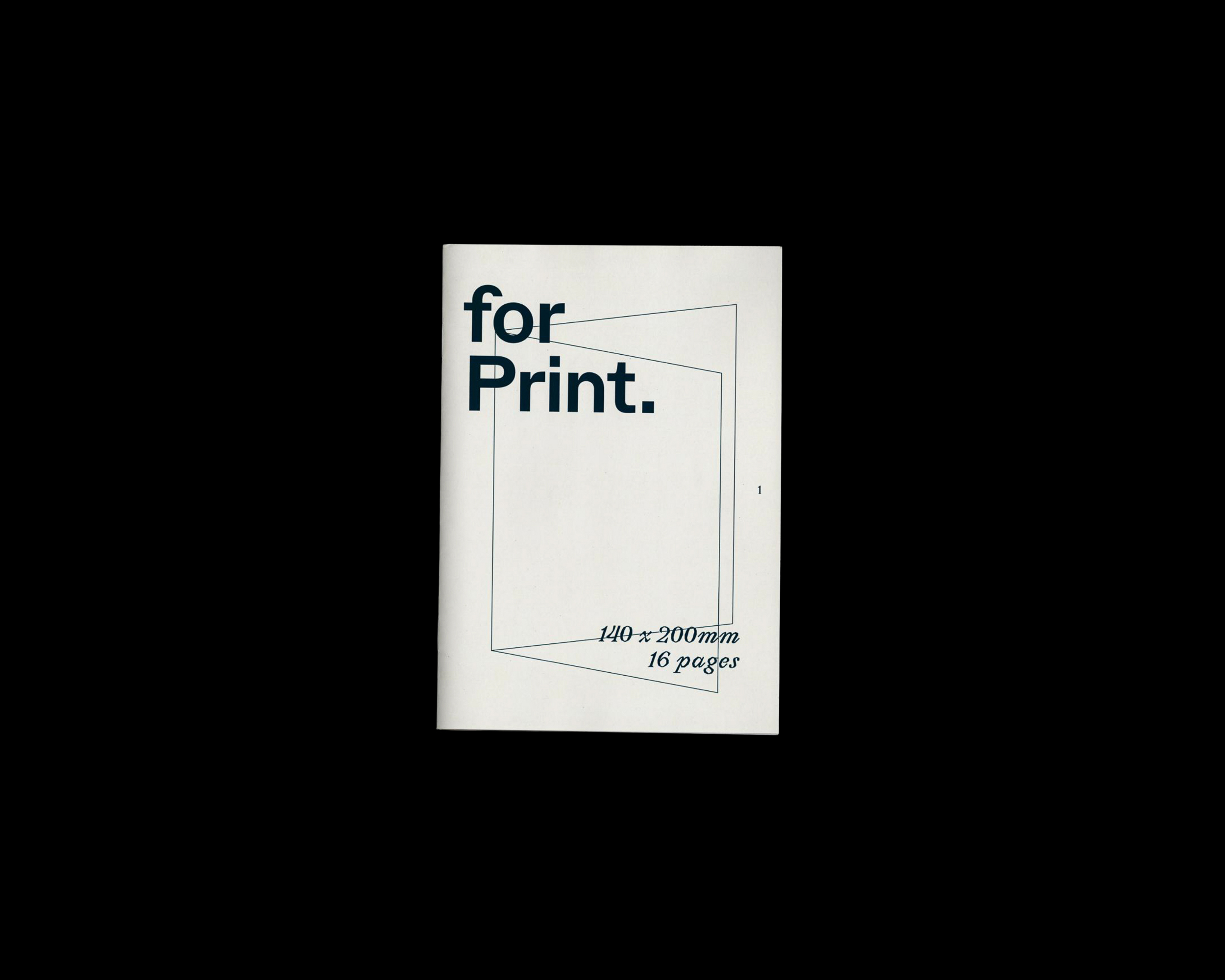
For Print 2025
Publication

A practical guide for second-year Communication Design students at Monash, introducing the fundamentals of print alongside a comprehensive risograph printing handbook.

See more ↳
No Reading Required
Publication

A printed response to Alice Rawsthorn's text on Isotype, exploring how visual language reshapes knowledge.

See more ↳
Chicken Rice Zine
Zine

My love letter to Hainanese chicken rice.

See more ↳